The strength of these layouts in most cases is the font selection, particularly in the first and last thumbnail. The custom cut font in the first layout along with the way it is laid out across the page is visually striking, it grabs the readers attention making it quite memorable. The web layout of the third design is an interesting and unique approach to solving the design problem of creating a resume and would no doubt stand out amongst a stack of applicants. The 6th design utilizes repetition of symbols to strengthen it's design as per the principles discussed in class. In the area of constructive criticism the 7th layout feels like it is missing something in the top right corner with that large blank space, and the headings in the 4th design are slanted on one side of the line and straight on the other and although that is varied repetition it could be stronger, perhaps having the headings be angled down on one side of the line and angled up on the other? it would be varied repetition of elements on either side of the line, but create a more cohesive feel overall.
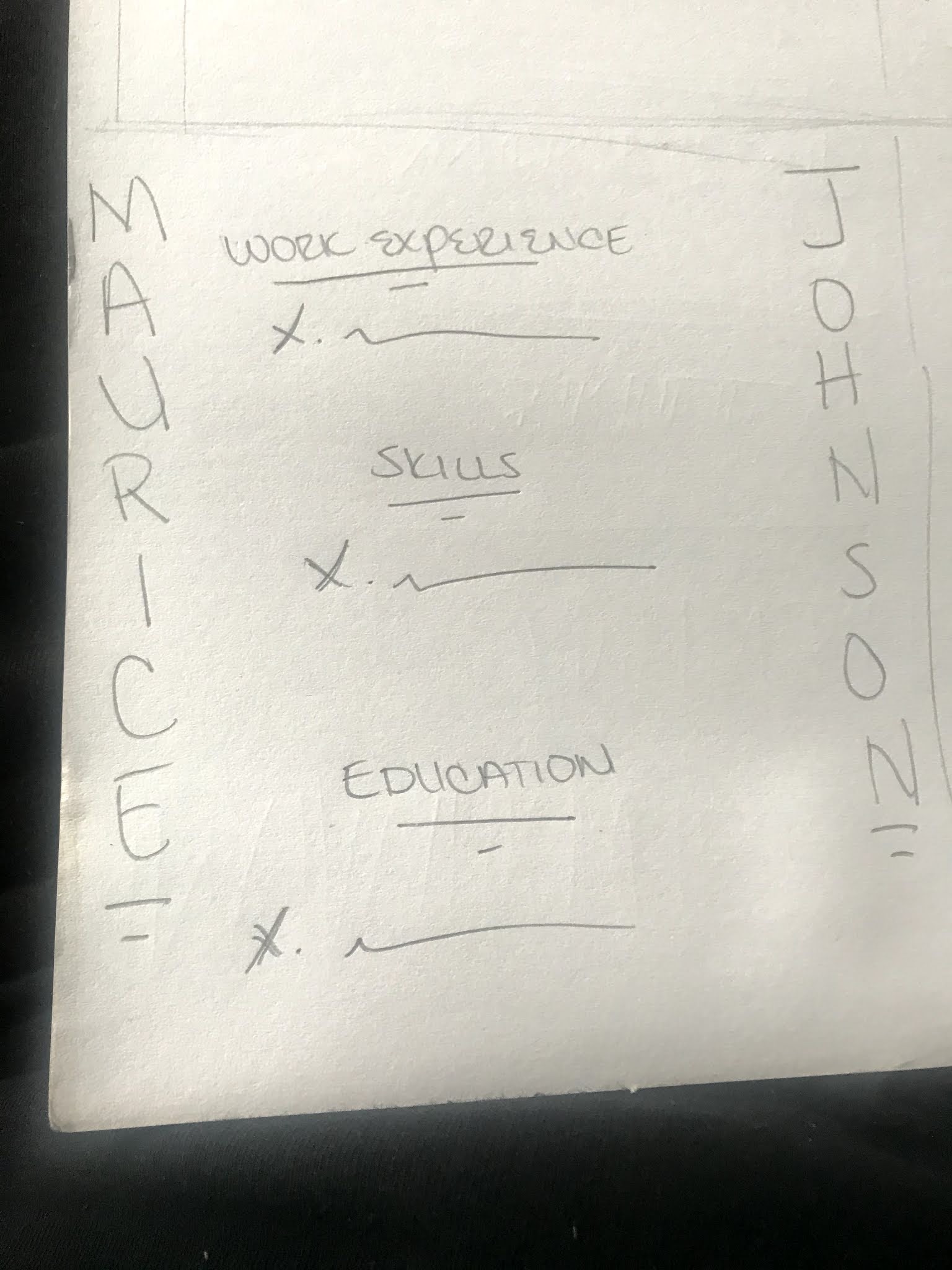
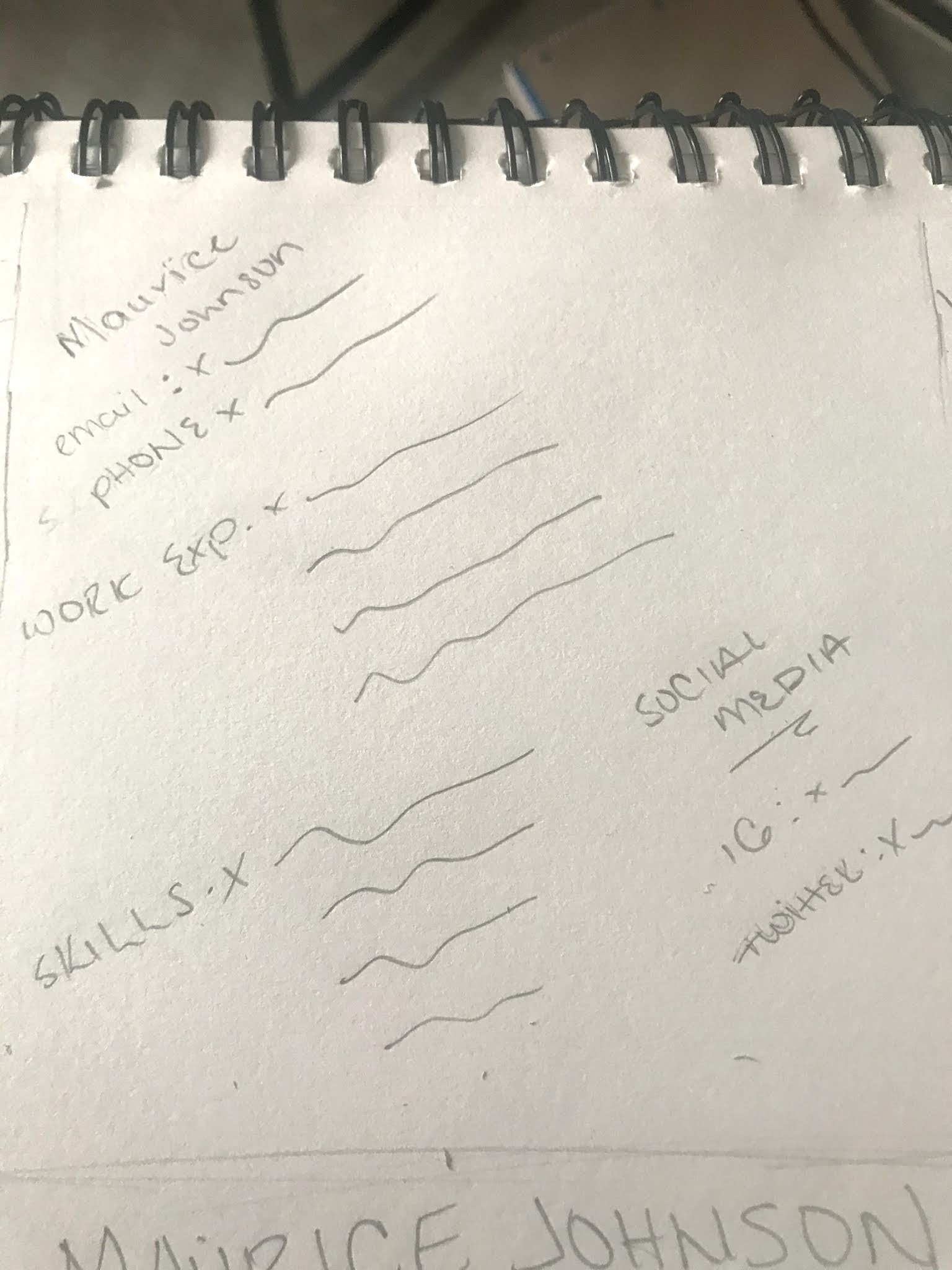
Maurice - The use of lines in these thumbnails is very well thought out, as each line gives a sense of visual cohesion and organization in the linking of the individual ideas, by lines, to the general idea and purpose of the resume.
The ideas that you generated, however, seem to lack a lot of the general information that would be necessary in a resume, which would affect your design process, that is, if you had included such fields as clubs, leadership roles, technical competence, or internships/the specifics of the classes you've taken.
thank you, Jake and Evan for the feedback for Maurice - good observations, and great assessments for the work; especially including design terminology and being thoughtful to the layout AND content. Nicely done.
Maurice - you're off to a decent start with this. Make sure to keep the thumbnails proportionate to the final size of 8.5" x 11" - if you don't feel comfortable working at the thumbnail size of 2.135"w x 2.75"h, then you can work half size at 4.25"w x 5.5" h. Let's discuss your resumé thumbnails in class on Wednesday.


The strength of these layouts in most cases is the font selection, particularly in the first and last thumbnail. The custom cut font in the first layout along with the way it is laid out across the page is visually striking, it grabs the readers attention making it quite memorable. The web layout of the third design is an interesting and unique approach to solving the design problem of creating a resume and would no doubt stand out amongst a stack of applicants. The 6th design utilizes repetition of symbols to strengthen it's design as per the principles discussed in class. In the area of constructive criticism the 7th layout feels like it is missing something in the top right corner with that large blank space, and the headings in the 4th design are slanted on one side of the line and straight on the other and although that is varied repetition it could be stronger, perhaps having the headings be angled down on one side of the line and angled up on the other? it would be varied repetition of elements on either side of the line, but create a more cohesive feel overall.
ReplyDeleteMaurice - The use of lines in these thumbnails is very well thought out, as each line gives a sense of visual cohesion and organization in the linking of the individual ideas, by lines, to the general idea and purpose of the resume.
DeleteThe ideas that you generated, however, seem to lack a lot of the general information that would be necessary in a resume, which would affect your design process, that is, if you had included such fields as clubs, leadership roles, technical competence, or internships/the specifics of the classes you've taken.
Solid work, good job.
Evan Atkins
thank you, Jake and Evan for the feedback for Maurice - good observations, and great assessments for the work; especially including design terminology and being thoughtful to the layout AND content. Nicely done.
DeleteMaurice - you're off to a decent start with this. Make sure to keep the thumbnails proportionate to the final size of 8.5" x 11" - if you don't feel comfortable working at the thumbnail size of 2.135"w x 2.75"h, then you can work half size at 4.25"w x 5.5" h. Let's discuss your resumé thumbnails in class on Wednesday.
ReplyDelete